For any paid media campaign that’s not running on pure awareness, there’s nearly always some form of goal conversion associated. Whether it’s a purchase of a product, generation of a lead, or engagement with a social profile, there’s an outcome we’re trying to achieve.
For the sake of this article, we’re going to refer to all of those actions as conversions. And the goal of increasing our conversion performance can be greatly impacted by increasing conversion rates.
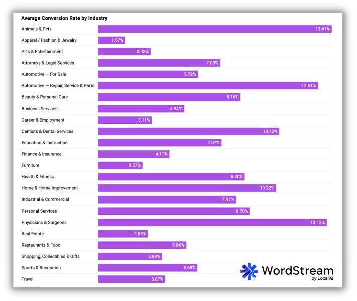
These were the average search advertising conversion rates for each industry from our Google Ads benchmarks.
In this article, I’ll discuss some of my favorite strategies for increasing conversion rates:
- Pay attention to page speed
- Provide sufficient, easy-to-digest information
- Include all types of social proof
- Set expectations for the conversion process
- Include multiple ways for users to convert
- Minimize required fields
I’ll also provide examples for a few different business types where possible to help make the illustration. Let’s get started.
1. Pay attention to page speed
It might not be the sexiest suggestion in this post, but page speed is still a huge factor in getting users to convert. I’m sure you know from your own experience that if a page loads slowly, it’s much more likely that you’re going to leave the page and find another site rather than wait seemingly forever to convert.
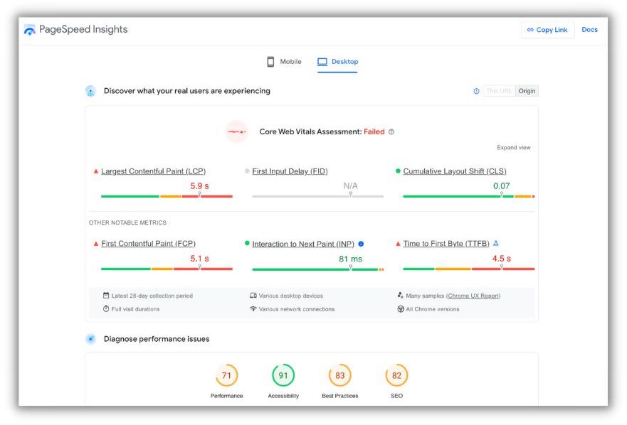
If you’re unsure of how fast your pages are loading or not sure what to do to make them run more quickly, you can use Google’s PageSpeed Insights tool to get a handle on both of those things.
2. Provide sufficient, easy-to-digest information
As business owners, product owners, or agencies who love our customers, we all likely have a passion for whatever we’re trying to promote online. Put that passion to good use!
Create landing pages with compelling information that gives an overview of your product or service and do so in an easy-to-digest fashion.
That could include any of the following:
- Product highlights and overview
- Call out of features
- Outline of benefits
- Technical specifications
- Usage or compatibility requirements
- Visualizations or videos
- And many more options
To give an example of this, I was looking at a single product and found two very different landing page experiences for it. The Jackery Solar Generator 1500 is a portable generator that can be recharged using portable solar panels. (Pretty darn cool if you ask me.)
When I searched for it, there were two options for purchasing: Jackery’s site and Walmart.
On the Walmart site, which is a largely trusted retailer, there’s a handful of product images at the top of the page and then some supporting information below.

And that’s…kind of all of it.
But if you visit the main Jackery site, you get quite a bit more information.
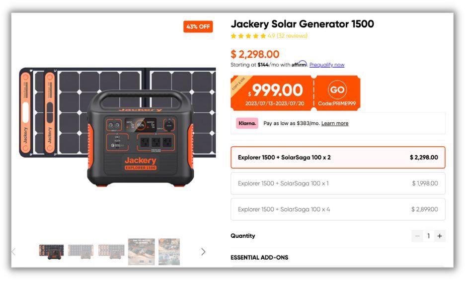
In the collection of images above, you can see there’s also a ton of additional information. The Features section on this page is quite long, but it gives an overview right off the top with visuals and stats that are easily read and understood. There’s an FAQ section, a visual Tech Specs area that ties directly to product components in the photo, as well as a Product Comparison section to help you find the product that fits your needs.
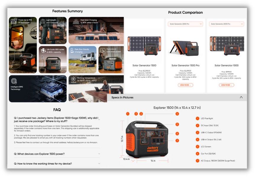
Now while I know there’s a big difference between Walmart selling a product for Jackery and Jackery being able to create the landing page of their dreams on their own site, the comparison still exists.
You can see on Walmart, we’re just trying to sell this product. Here’s the basics, that’s probably enough.
But on the Jackery site, they’re extremely proud of what they’ve built and have to offer that they’re showing it off in every way, shape, and form. They include tons of info to help people make what’s undeniably a large purchase, but do it with confidence that they’ve gotten exactly what they were looking for.
3. Include all types of social proof
Whether we want to admit it or not, the social standing of a product or service plays a role in whether someone will want to convert on your site or not. Be sure to include any instances of social proof you can come up with and allow those insights to do some of your promotional work for you. Here are some examples of what those could look like, sticking with the Jackery site to keep the example running.
Customer reviews
I honestly believe one of the most impactful selling points of a product or service is the reviews of previous customers. People aren’t shy about sharing their opinions online, so when you can have an overwhelmingly positive set of statements from customers, that goes a long way.
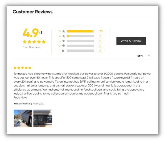
This is just one review from the Jackery site, but they have quite a few that look like this as well. You can visually see the 4.9/5 star rating that shows up and the highlighted bars in the columns in the middle very easily on the site because they’re yellow, which stands apart from the site’s main orange and dark gray theme. And even though when you look closer and see there are only 32 reviews, it’s still pretty compelling that there are no reviews lower than a 4 on this product.
Major media mentions
Another good social proof signal is including any major publication or media mentions your company or products have.
Unfortunately for my example, Jackery doesn’t have this option (or the next) on their landing page, but it does live on the About page on the site.
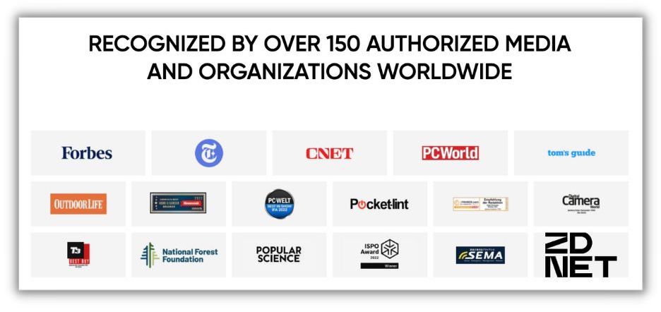
Including these gives credibility by affiliating you with other brands that users likely have heard of before, especially if that publication has lots of clout in a specific area.
For the logos above, as a person interested in green portable solar power, I find the mentions from Outdoor Life and National Forest Foundation to be particularly interesting. I’m also an amateur photographer, so the mention from Digital Camera World is also nice to see. You never know what publications will pique someone’s interest, so be sure to include any potential options on your site.
Awards, ratings, and certifications
Also found on the About page of the Jackery site is a quick overview of their certifications and awards.

Just like the media outlet mentions, these can be compelling for folks who are familiar with the field and help give your business credibility. Extra points if your competition doesn’t have similar awards for comparison.
4. Set expectations for the conversion process
Many customers will feel more comfortable taking a conversion action if they know what’s coming next. If they’ve never worked with your company before, this can help put them at least and, potentially, help prevent them from contacting your customer support prematurely or unnecessarily.
For an ecommerce account, this might seem a little strange. Add a product to cart, check out, it shows up at your door, right? Not quite.
How long will it take for you to package the product and get it in the mail? How long will it take once it’s there? Do you need to have someone ready to sign for the product or can it be dropped off at a door?
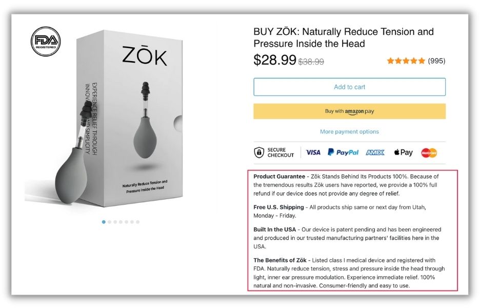
Source
For lead generation, this is even more important. Once a prospect fills out a form, how long will it be before they hear from you? In what format will they hear from you: phone call, email, calendar invite? Do they need to have anything prepped for that point of contact and what are the steps after that touch point?
When customers know what to expect, it’s easier for them to visualize working with you, making it more likely for them to convert.
5. Include multiple ways for users to convert
The conversion action you use will have a great impact on your conversion rates.
A very common “best practice” with conversion rate optimization is to include only one call to action on your landing page. This is intended to help avoid confusion and provide only one way forward (or backward) for the user to go. In some instances, this can help folks who want more information to convert but don’t have another path to take.
Personally, I’m a little allergic to that approach. While I certainly agree you can have a single call to action as the primary focus of a page, I don’t know if I agree with the fact that you should only ever have one action per page and never add a second.
All potential customers are different. Some like to conduct all their actions online. Others want to have a phone call. Some prefer to make a purchase in person. None of these people are “wrong,” they just have their ways of doing business.
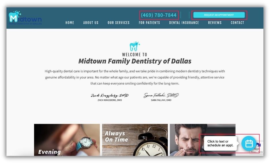
This dentist provides a phone number, a “request an appointment” button, or an option to request an appointment via chat.
If you choose to include only one form of conversion on the page, say a form fill for example, you’re alienating the users who would rather chat on the phone or come directly to your store.
If possible, I suggest always having a few different ways for users to get in touch with you, even if they’re found on other pages of the site, and simply track all of those actions.
For Ecommerce, this might seem like a miss, but I think this applies to online sales as well.
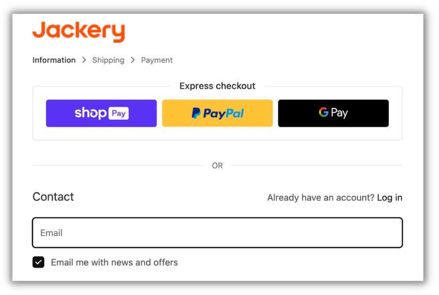
Again, some people are fine adding their credit card information to any site, but others are more weary of individual businesses having that data. They’d prefer to use a brand they trust like PayPal or Apple Pay. For retailers, I always suggest accepting multiple different forms of payment (assuming fees aren’t too daunting) to capture all of your potential market.
6. Minimize required fields
My last suggestion for increasing conversion rates is to think about what information you really need to call someone a conversion. Do you need their name, email, and phone number? Do you need their job title and the company they work for? Do you need their home address, city, state, and zip code?
Now stop and think, to follow up with someone, do you really need all of that information, or would it just be nice to have?
Asking for some of those “nice to have” pieces is great, but if you go overboard with too long of a form, you risk irritating someone and asking too much of them.
The example that drives me the most nuts is city, state, and zip code. If you have someone’s zip code, you can easily find their city and state. There are tools that do that automatically. Stop asking for all three fields when one will suffice.
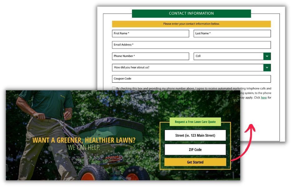
Limit your forms to only the information you actually need to follow up with someone and leave the “nice to haves” for future sales conversations.
Increase conversion rates with these simple tweaks
There’s no singular tactic that is guaranteed to increase your conversion rates. You’ll even notice that some of my suggestions here might seem to be contradictory. Put lots of useful information on the page, but also make sure it’s concise and loads quickly. Provide lots of ways for people to convert but also limit what you ask them for in that conversion process. Add and take away. Each of these is a tactic that I’ve seen work in the past. Now it’s up to you to test and find out which will work for your company.


